Here I mean “graphic” to mean both a visual representation of what our nation is ingesting, and the more colloquial sense of looking upon something that churns both one’s soul and stomach.
I saw this image from Visual Economics, representing Americans’ average ages, heights and weights, and the things we eat. The graphic’s title, too, seems to have two meanings: the informational sense of what we are eating, and the critical questioning.

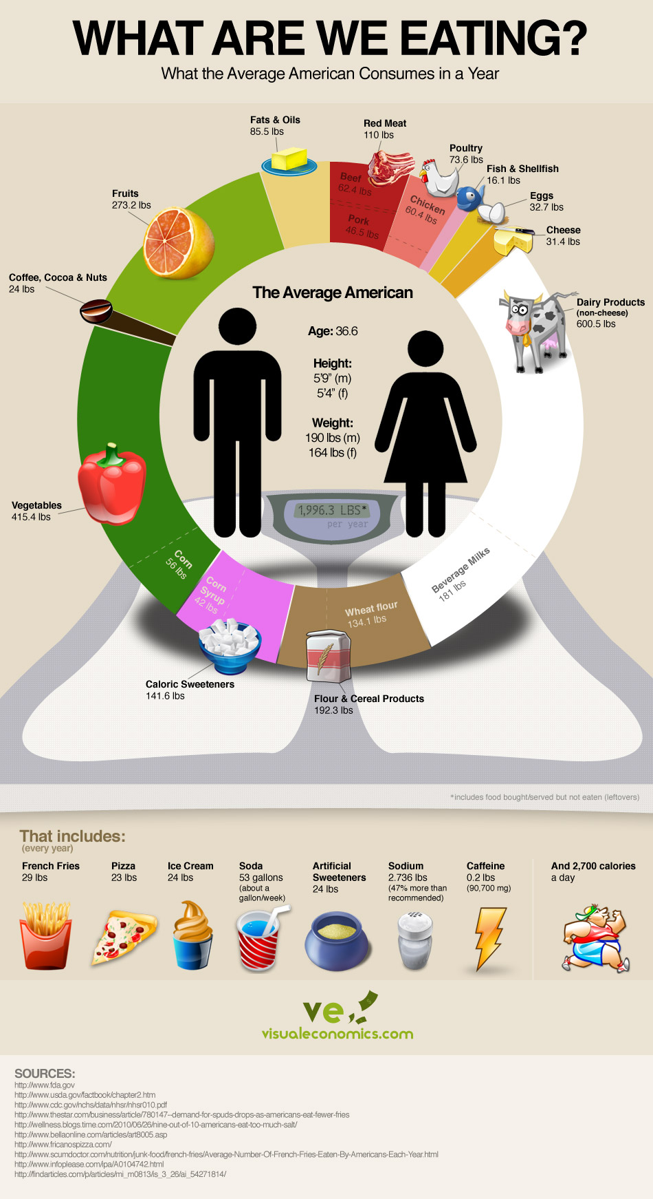
GADZOOKS. A full-sized (some might say American-sized) image is available at their site, and well worth a look. For instance, 864.3 of the average 1,996.3 pounds we are thought to consume are animal-based products: meat and dairy. That is, by anyone’s account, a lot. We know Americans eat a lot of these things, but to see it measured out such is shocking, at least to me. Josh and I both are vegan; I found myself wondering with what we filled that 864-pound void. Probably vegan mac-and-cheese, or Simply Decadent non-dairy ice cream. Possibly beer (which, strangely, is not represented). I am certain to have a higher percentage of “caloric sweeteners.” I have a rapacious sweet tooth, something I strive constantly to curb.
Look at some of the pull-outs:
— 53 gallons of soda
— 29 pounds of French fries
— 25 pounds of pizza
— 47 percent more sodium than is advisable
— 42 pounds of corn syrup
One can look at the stats provided for men’s and women’s heights and weights, and deduce they are well over weight. I am 6’4″ tall, 180 at my heaviest (damn you, Christmas cookies), 170 at my lowest. That is, according to this graphic, 10 to 20 pounds lighter than a man more than half a foot shorter. Holy Moses!
Many runners enter, and remain committed to, this wonderful endeavor via a desire for weight loss, like our pal Brandon. Who doesn’t know such a story? We hear obesity obesity obesity, but sometimes it takes images like the one above, or the controversial ads from Children’s Healthcare of Atlanta, to truly bring our attention to a point.
But look at the very last image: a tubby little runner, a look of determination toward burning some of that excess he is carting around, and using a portion of those estimated 2,700 daily calories. Do you think our pudgy shuffler will hustle past the edge of the box before Pandora can snap shut the lid? Does he represent our Hope? What is your reaction to this graphic? What is your diet, O pioneer?
Reblogged this on Health in your meal.
It’s not that I disagree that people make eating choices based on things other than health, but I always wonder about the consumption stats. What are they based on? There’s no calorie meter on me (though that would be SUPER helpful), so where does this research come from? Looking at the government sites sited above, it seems that some of these stats are based on product SOLD. It’s generally accepted that Americans waste food, so is that factored in? Do we really consume all we buy? I don’t know… I just wonder how much of that is left out for “shock” value. Of course it is an info graphic and not a Master’s Thesis, so maybe I’m over thinking. :-)